
Seven moons
Afflicted with both myopia and astigmatism, Kohei Sugiura is acutely aware of the act of “seeing.” For example, due to his myopia he often sees three or four moons, or even seven moons on top of each other, he says. In other words, we don’t all see the same world. There is a deviation between supposedly universal phenomena and everybody’s personal experience of them. Rather than compensating for this deviation, Sugiura decided to accept it as it was and turned it into the point of departure for his designs.
Fluttering eyeballs
When people reproduce a visual signal by hand, they usually draw an outline. They make some kind of contour detection. But in the myopic eye, there is no sharp image drawn on the retina in the first place, so simple line processing won’t work. Even if you don’t have myopia or astigmatism, when you fixate an object, your eyes actually keep making quick movements. Experiments have shown that if those movements are stopped, the image vanishes from the retina. Contours, or the supposed shapes of objects, seem to be intimately connected to factors like fluctuation and deviations. “Never draw contours too facilely” and “Contours always fluctuate” are two premises of Sugiura’s designs.
Thing that fall between the cracks
Not drawing contours too facilely is an important theme not just in design but in analysis and verbal expression as well. When you express a form by drawing a straight line from A to B, that is because A and B are all you know; your measuring instrument didn’t pick up anything in between. Probably the same happens in analysis. Perhaps an awareness of things and events that fall aside from the line between A and B will be necessary to proceed to the next step in both verbal expression and analysis, as well as in design.
Signs of shapes
Another fundamental aspect of Sugiura’s designs is “discovering shapes for things that have no form.” However, finding “signs of forms” among formless things is not an easy task. It requires both long experience and a profound intuition. Phenomena such as economic fluctuations that are easily converted to numerical values can be expressed on a simple coordinate axis. But hyperspatial phenomena like the transience of time and sensations cannot be dealt with quite that straightforwardly. First you have to find an axis among those hyperspatial phenomena in order to make invisible forms visible.
Taste maps
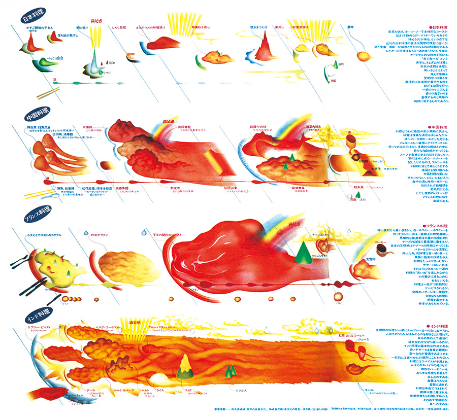
Based on descriptions of tasting experiences by the food critic Toyoo Tamamura, Sugiura created four diagrams for Japanese, French, Chinese and Indian cuisine, incorporating data on the differences and variations in ingredients, cooking methods and volume, and how often alcoholic beverages were drunk during the meal.
A Japanese meal is like an “archipelago,” with lots of small dishes presented one after the other. A Chinese meal, where a number of big plates are served more or less at the same time, offering complex and fascinating flavors, is more “small group style.” French cuisine, which features a voluminous main dish of meat, is a soaring “Alps style,” while Indian food, with an assortment of curries and rice on a plate that get mixed in the mouth, is like the pungent “flow of the river Ganges.” The satisfaction with the meal is also charted: for the Chinese and French meals a “satisfaction rainbow” appears. The Japanese dinner was a simple Buddhist vegetarian meal that was hard to put a rainbow on.
(First published in Shukan Asahi Hyakka no. 136, Asahi Shimbun Co., 1983)
Dog maps
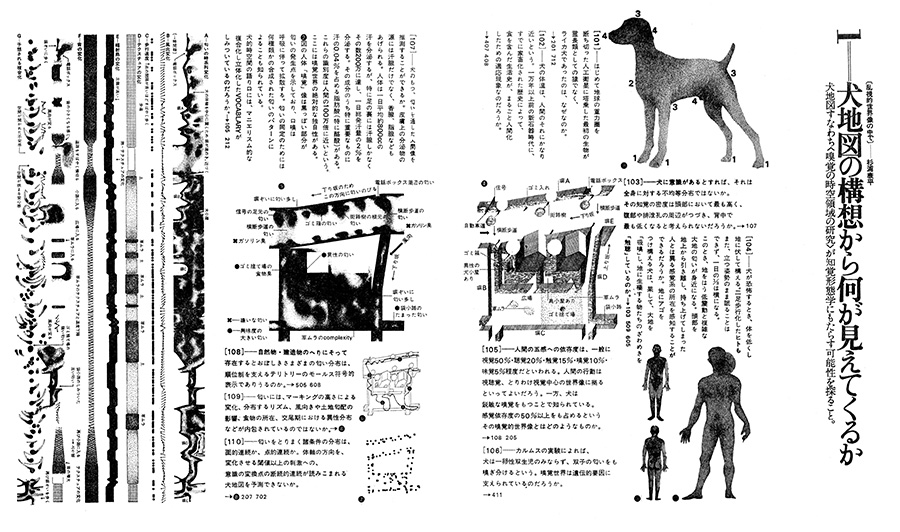
These were invented by Sugiura when he was walking his dog. He first established which route the dog was walking, and determined a number of parameters for things that the dog might be interested in, such as signs of dogs of the opposite sex, the smell of food, gradients in the path, temperature variations, wind direction, sounds, etc. He then turned those environments into a set of diagrams. Ultimately, however, the diagrams aren’t based on any proper analysis, but just on informal hunches about the dog’s behavior.
(First published in the magazine Yu no. 6, Kousakusha, 1973.)
Time hierarchies
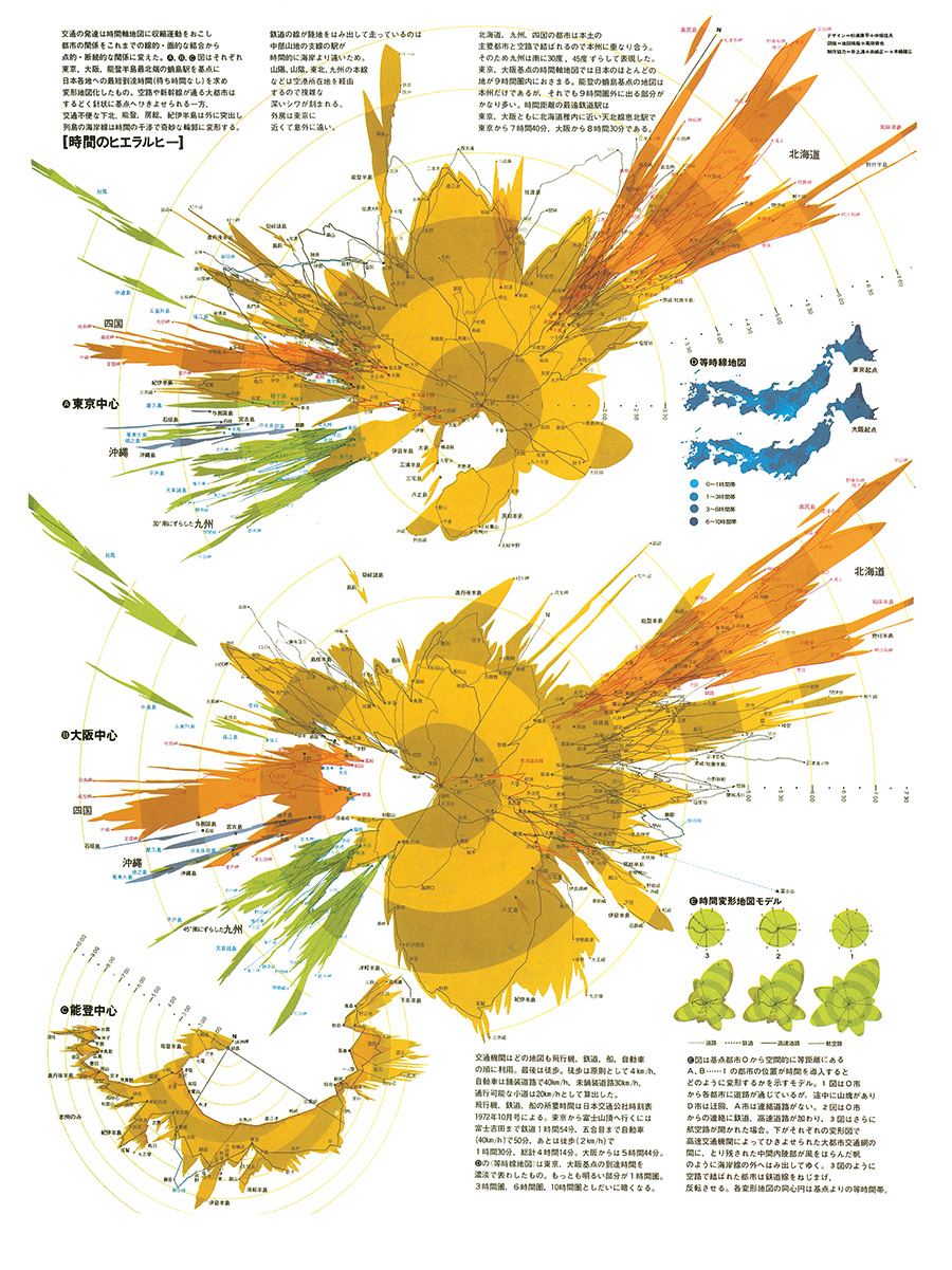
Maps centering on temporal distances. The points of departure in the two large maps are Tokyo station (top) and Osaka station (bottom), with Kanazawa as the origin in the small map (bottom left). The fixed positional distances are contracted or expanded on the axis of time, leading to radical deformations of the map of Japan. When a new air route opens up to a city that was previously only reachable by train, that city is pulled dramatically closer. Meanwhile, remote regions are left isolated behind, even further away than on a conventional map. Mt. Fuji is located between Tokyo and Nagoya, but the time it takes to reach the top is much longer than the geographical distance, and so the mountain flies far at sea.
Developmental differences are extremely strongly emphasized in these time maps. A change in the point of departure leads to a radical transformation of the shape of Japan.
The maps were an attempt to create a “multi-layered, resonating mode of presentation” by juxtaposing a basic topographic map with a temporal map focusing on the major cities. They emphasized the difference between the terrain shown on the government’s bird’s-eye view land management maps on the one hand, and the cultural behavior expressed in the time maps on the other, and also established a method of “multi-perspectival thought.” Such overlaps would subsequently form the basis of Sugiura’s diagrams, and used to illustrate the philosophy of “many that are one, one that is many.”
(Sekai daihyakka nenkan 1973 [World Encyclopedic Yearbook 1973], Heibonsha.)
Soft maps
Maps are born out of a desire to see and know the appearance of the world around us. General maps aim to be objective and universal, and the relationship between a map and local details is like that between a dictionary and words: the clearer it is, the more accurate it is. Maps can also show things invisible to the naked eye, such as geological strata. By drilling according to a geological map, you can confirm the locations of hot springs and coal layers. They are part of the “hard world” that no-one doubts.
Introducing a new axis is a method of capturing that undoubted hardness in a soft way, an expression of critical awareness. Drawing a map around an axis of sensations or time, for example, makes the supposedly “hard” and “universal” world look like something else altogether.
Hands and intuition
Sugiura’s most important tools are his hands. Infographics are built on data: data that are strictly digital, numerical values from which human emotions and similar excess baggage have been scraped off. That is precisely why you can make objective and cool-headed images of the data, but in the end those images could also be created by a computer. When you work by hand, you have to proceed slowly and confirm the details at every step. It is in those gaps you might discover new, previously unknown themes hidden away inside the subject matter, things that slip through the cracks during computer processing. A flash of inspiration, and after some verification and a leap of imagination, an “intuition” is born. The work may sometimes seem slow and frustrating, but thanks to that fingertip touch, “astigmatic” images reveal themselves.
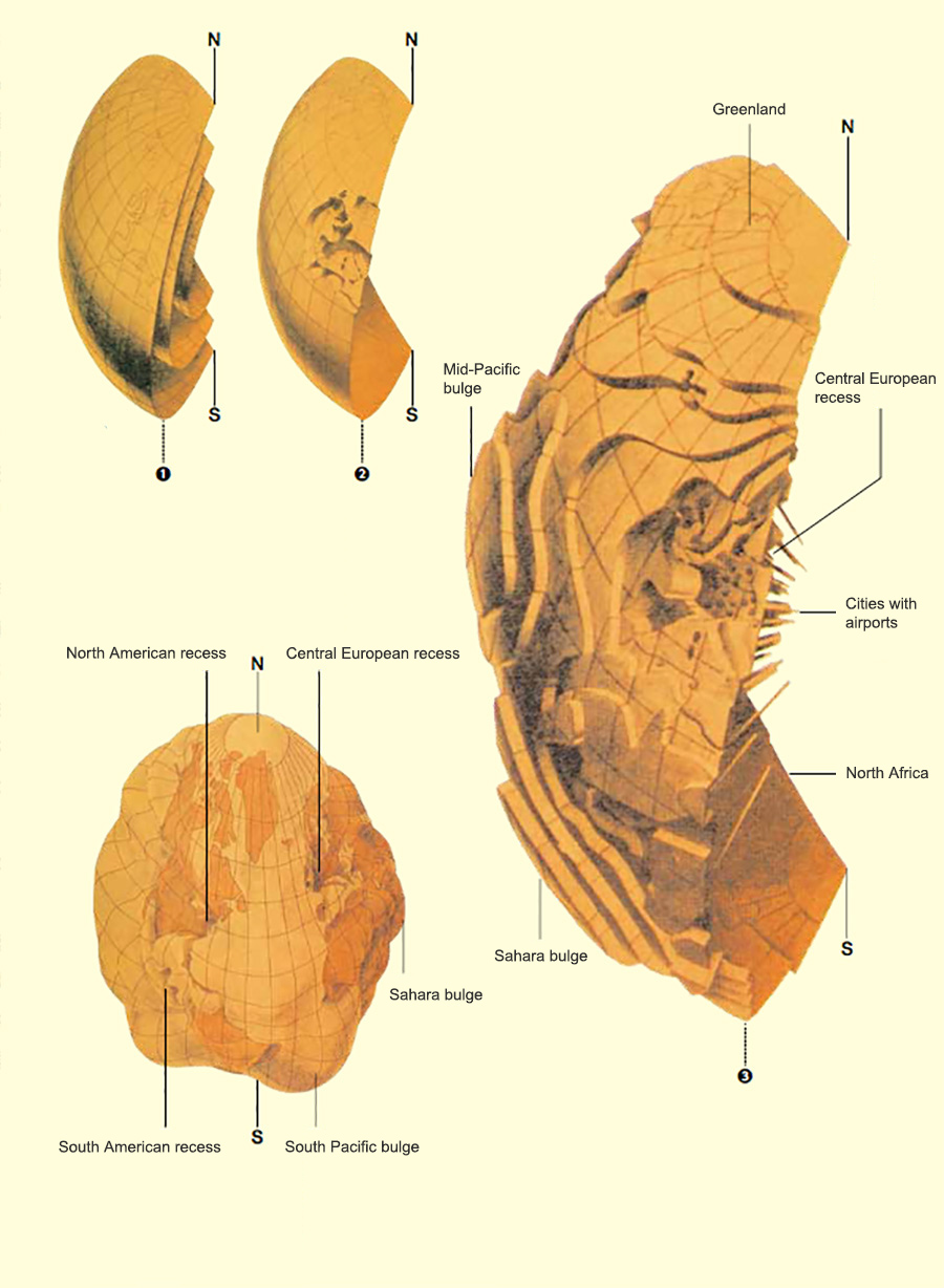
Globe transformed on a temporal axis
and the corresponding stereoscopic image
Utilizing the concept of a temporal axis in a sphere rather than on a flat map creates a terrestrial globe the like of which has never been seen before. Data about differences in the development of transportation systems and variations in speed correspond to irregularities on the surface. The shorter distance between two points on the recessed layers indicate a shorter travel time, and the longer distance between two points on the outer, bulging layers indicate a longer travel time. For example, since London and New York are connected by airplane, the distance between the two cities is shortened and their surface areas shrink. Cities with major airports are located on the smallest (innermost) sphere, while regions where walking is the only option spread out on the largest (outermost) sphere.
Figs. 1 and 2 show a globe with three layers, caved in according to the development of transportation. The high state of development in Western Europe is evident. Fig. 3 shows a more detailed globe with eight layers.
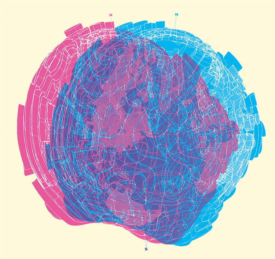
The red and blue figure below is a stereoscopic rendering of a deformed globe.
(Yu no. 1, Kousakusha, 1971 / Graphic Design no. 32, Kodansha, 1968.)
Moving weather charts
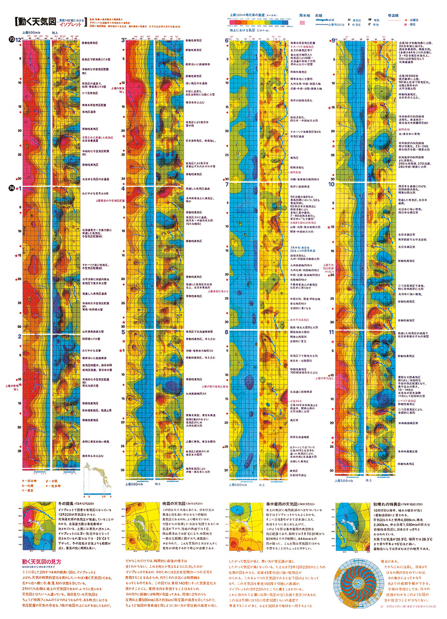
Variations in weather conditions such as pressure and temperature are continuously represented as a “moving weather chart” along a time axis. From top left to right, the seasons change through spring, summer, fall and winter. The data are given for east longitude 140° (which crosses Japan), with weather changes on the ground throughout the year listed to right of the chart, and changes at the isobaric surface at approx. 5 km altitude to the left.
(Sekai daihyakka nenkan 1975 [World Encyclopedic Yearbook 1975], Heibonsha.)
This article was prepared by the “abiroh” Editorial Department based on an interview with Kohei Sugiura. Copyrights for illustrations and descriptions belong to Kohei Sugiura.
[Reference literature]……… A large collection of Kohei Sugiura’s diagrams can be found in the book Jikan no hida, kuukan no shiwa… (Kashima Publishing, 2014; text in Japanese only). For more information in English about the diagrams described in this article, see Kohei Sugiura: Forms Come Alive (Chinese University Press, Hong Kong, 2016).